Before showing any game to playtesters I like to have as pretty a version of the game as possible. This is my preference and might not suit all tastes, however I do know that a more polished prototype does improve gameplay.
- Players might feel more like they’re in your theme than if it was just text scribbled on cards;
- They will be able to recognize certain patterns or types of resources or cards easier because they share the same colour or symbol and
- Your playtesters will take you more serious when the prototype looks like you spent more than a half hour on it.
So how nice are we talking? At this stage we’re still just talking about doing everything yourself. Don’t take anything to a printer yet! This stage will require some computer skills and while you don’t have to be an artist, you will need a good eye for layout and presentation.
 You’re going to need some sort of drawing program. For all of our art we use a program called Corel Draw. This is a vector based drawing program which means you can resize your images without losing any resolution. Adobe Illustrator is another fine vector based program – whatever you’re comfortable with is fine. Even if you don’t have these programs you could use PowerPoint or even Word (but be prepared for a lot of frustration!). Drawing programs make it easier to line things up and duplicate your efforts easily. There is a learning curve, but if you plan on becoming a designer then you should get to know at least one drawing program.
We like to add some flavour to our prototypes by adding clipart. Used poorly though and clipart can be quite ugly, but if you only use it to help tell your story and make your game easier to play, then use clipart for sure! If we need an elf or a gun or a train then we look it up in our clipart program. We like to ensure that anything that needs a symbol to help players recognize it has it. So instead of saying 3 Gold, we’d rather show an image of 3 Gold coins.
These clipart packages are better than just searching online. Searching online for images you will come across two challenges.
- Most of the good clipart is not free. You will have to either pay for the good stuff, or use clipart with watermarks all over it.
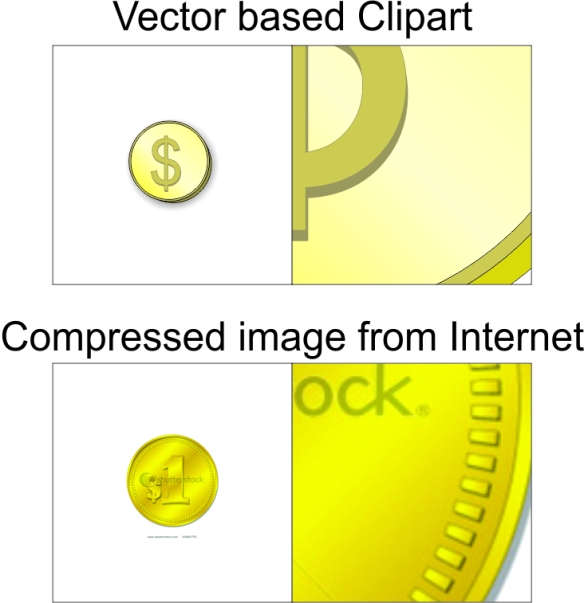
- Most of the clipart you find online will not be vector based. Mostly you’ll find jpgs and gifs. The challenge with this is that you cannot resize these images very well without them getting blurry – but more importantly, you can’t alter anything about them at all. For Night of the Dragon I found a great clipart of a Dragon, but I needed it to be red as all the other colours were taken by player pieces and if it was the same colour as a player it would add too much confusion. Because it was vector based clipart I was easily able to change the colour. If I had downloaded that from online then I would be stuck with the colour it came in. Note: If you don’t have a vector based drawing program, then you’re going to have to use jpgs and other compressed images.
Clipart packages can be pretty cheap now and is a very integral part of our game design process.
One other tip about working with a computer for game design: when you come back to your drawing program to make some tweaks (and oh it will happen…a lot!), I highly recommend to resave the file as a newer version (v1, v2, v3 etc…). This way if you ever need to revert back to an older version for some reason, you won’t have to waste time recreating something you already created. This has helped us a lot as we have often had to revert back some aspects of some games as we were making prototypes and playtesting.
-Jay Cormier
As we are finding out working with more and more graphic designers (i.e. people who know more than we do about graphics), one key to strong design is “flow of information” or, put in another way – how well is the information conveyed from the cards or board to the players?
We think a lot about this when we’re doing the graphic design portion of things.
For example, if you look at the cards for “Belfort”, the originals have crappy artwork, but the layout is clean and consistent – especially the costs. They were all made in a specific order so that you could easily scan down the left side of each card and compare costs, even when the cards were fanned out in your hand.
A little forethought goes a long way with this, because it makes the game not only nicer to look at, but easier to play. And one of the biggest detractors in any game – for Jay and I, anyway – is downtime. Whether it be caused by “analysis paralysis” when there is too much information getting all jumbled up thus slowing down your decisions or by players having to look here and there and everywhere to get the information they need, it’s all bad. Good layout of the information on your cards, board, player aids, etc. can take seconds or even minutes off each players turn. And while that doesn’t seem like much – imagine if there are 5 players, each having 6 turns in a game… Simple math will tell you that shaving 30 seconds off each player’s turn will save you 15 minutes of total game time, which can definitely influence how quick some gaming groups are to pick up a game to play. We often make player aids with charts etc. to better consolidate information so people can compare and contrast costs, benefits all in one place.
We also spend a lot of time trying to come up with clear and instantly recognizable iconography for anything that gets used consistently through a given game. Jay’s example of the Gold Piece above illustrates a very common, repetitive icon – I’m sure we’ve used that specific one in over 75% of our prototypes so far, in fact! Icons are so much quicker to scan through than text – which, even though you may be a quick reader, you still have to decode. And if there is a lot of text on a card, it takes that much longer to decode it all and distill what might be important to you this turn. If you can have it presented to you in as few icons as possible + a few choice words to impart the gist of the card, that is infinitely better than having it spelled out for your in pure text, in my opinion.
While a picture can say a thousand words, solid graphic design can speak a thousand languages. With the hope for localization of our games to other countries (Germany, here we come!), we always try to keep any high-cost components (things that would need to be die cut, etc. like decks of cards, boards, etc.) to be as text free as possible to minimize the amount of translation that needs to be done. Whenever possible, we like to use icons in place of text.
SO! While your prototype doesn’t have to have Quentin Hoover level artwork on the cards (He’s one of my favourite MtG artists), well-thought out and strategically planned graphic design can help playtesters to understand and play the game faster and better. And that’s one step closer to getting a prospective publisher to accept a submission from you – the cleaner your game is from the moment they get it in their hands, the better shot you have of taking it all the way to publication.
-Sen-Foong Lim


Hey I’m an amateur game designer working on self-publishing and was wondering if there was a vector-based clip art package you’d recommend?
Thanks and keep up the unique and helpful blog!
-Justin
LikeLike
You know, Justin, we’ve never found a specific package that we could recommend. I’d be interested in one that had fantasy / military / sci-fi graphics. If I find anything, I’ll post here – if you do the same, we’d appreciate it.
I definitely one that has an easily searchable catalogue! The one we use now…it’s so cumbersome! We have to look through this large book to find out what CD the file is on, then dig through the CD (that has awful file names, btw) to put the clipart into the artwork.
LikeLike
http://clip-art-review.toptenreviews.com/
Check out this article for the top packages according to these guys.
LikeLike
Thanks for the reply and good luck at the BGG Convention! I’m determined to be at the next one with the game I’m working on now in hand.
Some great content on the site – thanks so much guys and keep it up!
LikeLike
No problem And I think Jay will be updating his experience at BGG.con over the next few days – be on the lookout for some exciting news!
LikeLike
Pingback: Этап 10: Украсьте ваш прототип: Стадия 1 — Компьютер | Персональная страница Петра Черевко — сайт, посвященный обзорам бытовой техники, �
I’ve been reading through all the steps you have here – really good stuff. In this post you mentioned that you like icons and vector based graphics. One website that I recently discovered was the Noun Project.
It has royalty free icons that are vector based; maybe it’s worth checking out:
https://thenounproject.com/
LikeLike
Hi Jay & Sen,
Thoroughly enjoy your blog, I have a question re; prototype artwork; I’ve used copy written graphics for the game I’m developing (taken from google images), prototype is looking really slick but will a publisher mind when I’m pitching? At what point do such graphics need to be removed?
LikeLike